Hello,
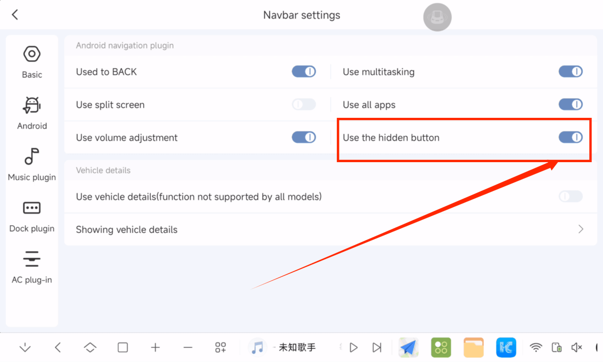
Am I the only one who doesn’t like the new font? I believe it is too big, at least on a 11.5” screen, the previous menu was much nicer with the old font. Everything fitted nicely without having to go up and down. Now everything is too big and doesn’t fit nice in the screen. Perhaps the new font is better for smaller screens in order to be easier to read, but on bigger screens (11.5, 13) it looks very clattered. Bigger font makes the screen look like cheaper low resolution screens. I am talking mainly for the left side main menu, which is spaced too much in my opinion. It should fit vertically on screen without having to scroll down. Too much space between menus. Is there any way to make it smaller? I wish we had an option to select the size or at least select the previous menu arrangement.
Also, can we roll back to 3.5 and how?