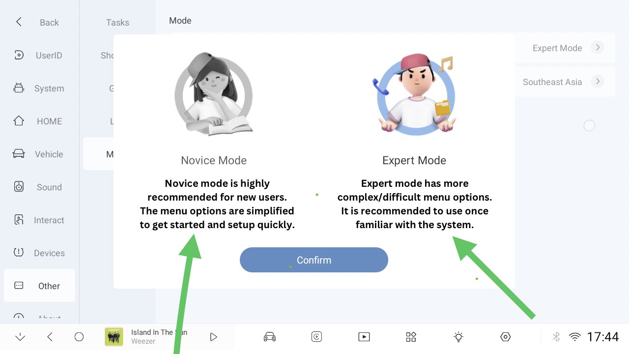
@YAOXILONG @DUDU-HUANG apologies for the @ but it’s been 4 months 🫣
This is something that still needs fixing.
The text should be centred under each mode, at the moment it looks awful 😞 and likely a quick and easy win to sort, it’s the main thing that looks out of place across the whole of the settings.
It should look like this:

👍