Hi all,
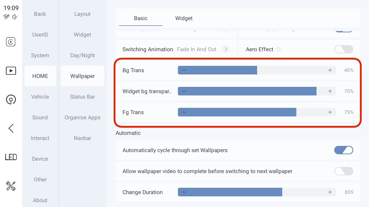
The following area within the Wallpaper settings and mini winget settings, i think, needs to be looked at:
I would suggest maybe one of the following would work:
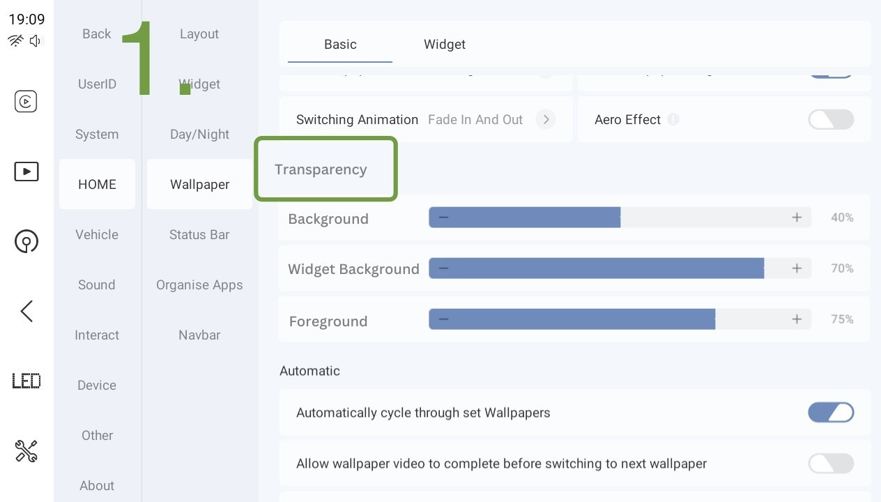
1.
Add a sub heading labelled ‘Transparency settings’, this will free up space to add full words in removing transparency out of each title.
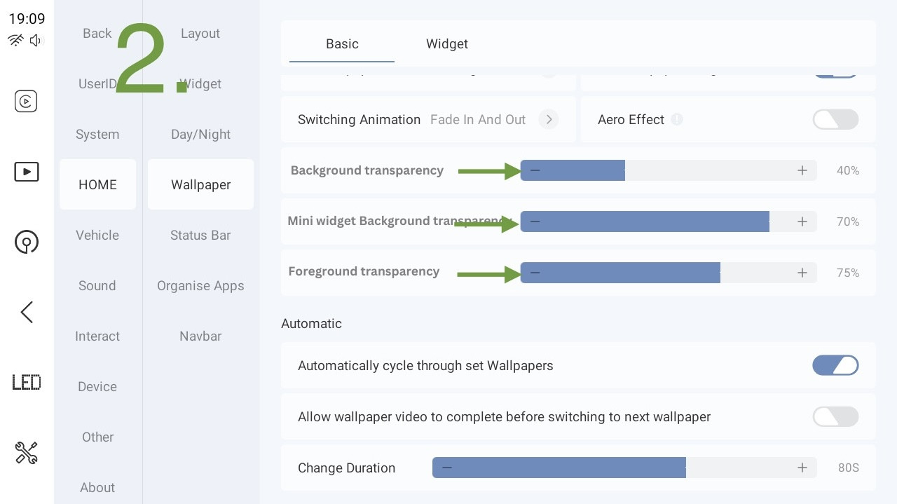
- Shorten the blue bars to free up more space to add full words
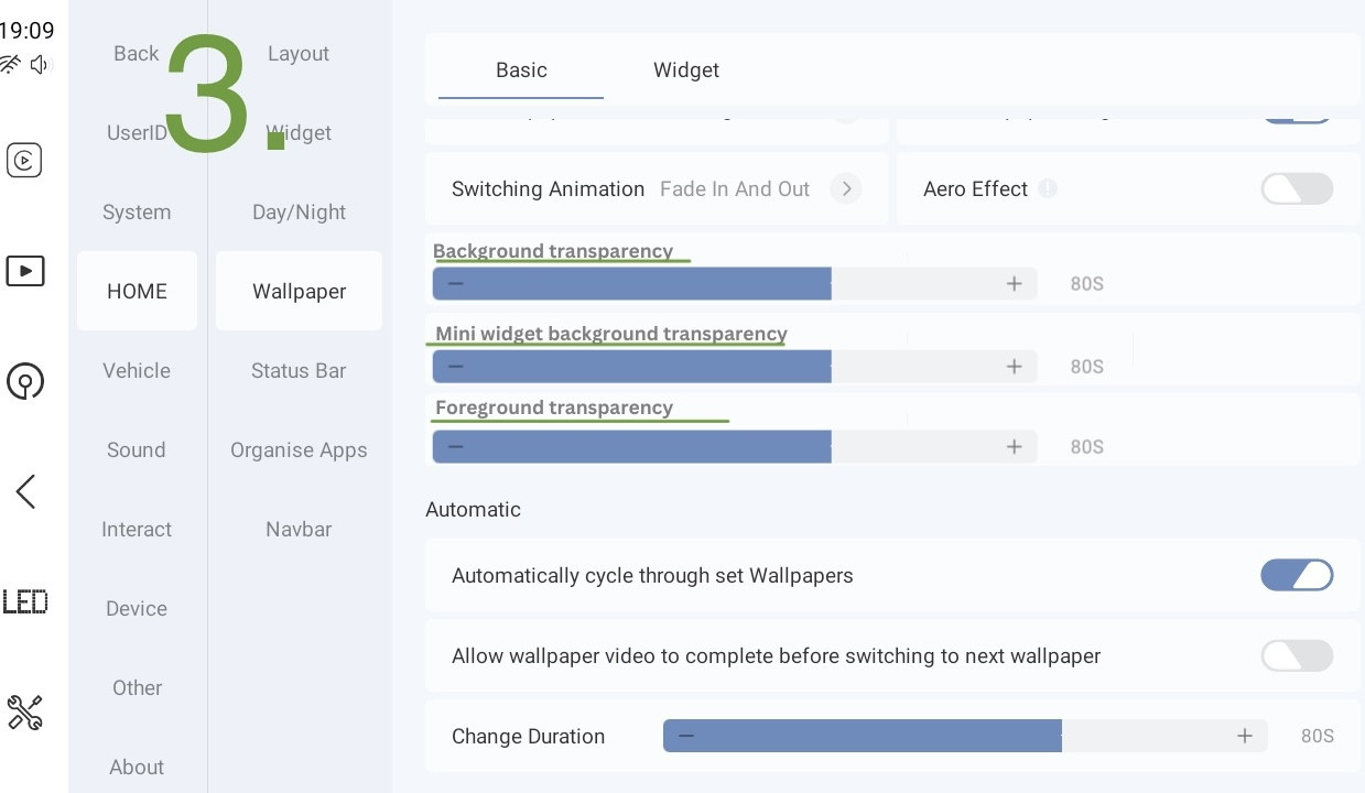
- Relocate the field descriptions on top the blue bars instead of the left
————————————-
Taking into account the mini widget menu in the follow video, I think number 3 would best fit..
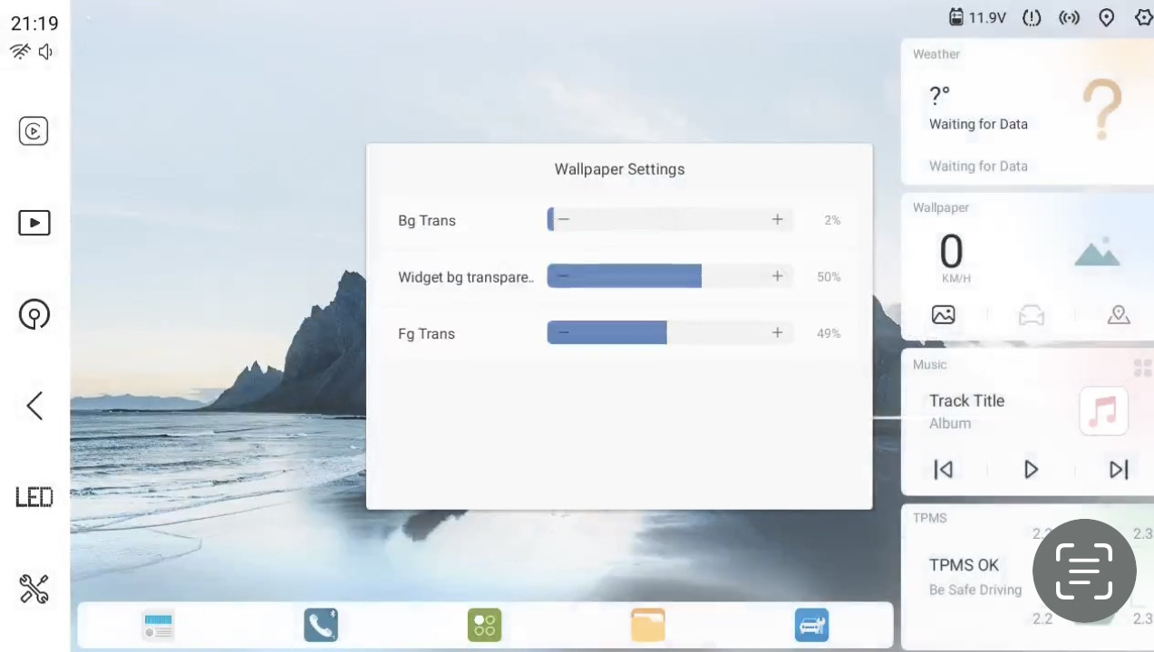
To also help translate these better, would it be possible to further explain what each does? The first can be seen and the last only applies to the dark theme, but the middle doesn’t seem to do anything…
Thanks
Matt